

Wesource

Project overview
As a UX designer collaborating with the Campus Food Bank, I want to help the food bank run more efficiently. Wesource, as a complement to the Campus Food Bank, aims to empower students to better use resources and alleviate problems arising from inadequate information.
Time
Sep 2023-Dec 2023
Duration
14 weeks
Sectors
Non-profit, Health, Education
Design role
User experience Research User experience Design User interface Design Prototyping
Start from zero: Designing an app for resource discovery
As a junior UX designer, I eagerly sought to engage with some real-world projects, and I was fortunate to have a valuable opportunity to take my first step.
Campus Food Bank hoped someone could help them design an app to help students discover more on-campus and off-campus resources. This would assist students in accessing free or low-cost help (such as finding free food, locating second-hand items, and receiving academic support) and alleviate problems arising from inadequate information.
At this point, I barely knew what exactly Campus Food Bank was, what the problem was, and what users wanted. I needed to start from zero, but it also meant endless possibilities.
What exactly is the Campus Food Bank?
The Campus Food Bank is an independent charity supporting members of the University of Alberta, which works and advocates to guarantee everyone in the U of A has access to food and food education.
As an on-campus resource, the supplementary grocery program in the Campus Food Bank provides free food for U of A members. After scheduling a time slot on the Campus Food Bank website, students can visit the Campus Food Bank where they can freely browse and select products just like shopping offline. Even better -- these products are completely free of charge!

problem Discovery
After understanding what is the Campus Food Bank and the requirements from the Campus Food Bank, I started my initial research to know the pain points.
In a fall 2021 survey of 6,167 students at 13 Canadian university campuses, the study explored why students hadn’t accessed food banks and other initiatives:
12.7%
Uncomfortable accessing these
7.8%
Location is inconvenient
6.8%
Hours are inconvenient
4.7%

Do not like/want what is offered
The result shows that both subjective factors (emotion and preferences of resources) and objective factors (time and location) can prevent students from using food banks and other resources.
Problem statement
How might I design an app to help students effectively use the Campus Food Bank and other free or low-cost resources they need?
Research & Explanation
What UX research methods will I use to find the solutions and why?
UX research method 1: User survey
I aimed to understand why students fail to effectively use the Campus Food Bank. To identify user needs, I conducted quantitative research by analyzing the 2023 Client Survey of 406 users, focusing on their pain points.
Key insight 1
Limited food intake does not cover users’ requirements.

79.3%
of clients reported that the Campus Food Bank provides less than 50% of their food intake over two weeks.
20.4%
of the clients are not able to cover the rest of their food intake by themselves.
Key insight 2
The categories of groceries are limited.

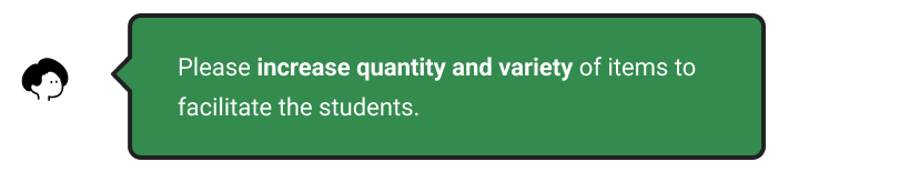

Key insight 3
Out-of-stock items negatively impact the shopping experience.


Key insight 4
The Campus Food Bank's fixed time and location can cause scheduling and commuting challenges for users.
63.6%
of the clients have experienced a lack of access to the CFB service due to commuting difficulties.


Besides Campus Food Bank,
78%
of the users wish to have access to more information regarding other resources.
(e.g., subsidized daycare, healthcare services, Peer Support Center, etc.)
Why do students need more free or low-cost resources, and what prevents them from using these resources?
UX research method 2: User interview & secondary research
I conducted interviews with 6 students to understand the barriers they faced when using other free or low-cost resources.
Key insight 5
When Campus Food Banks are unable to meet students’ needs, students require more free or low-cost resources to fulfill personal requirements and reduce financial pressure.


Key insight 6
Both subjective factors (awareness, emotions, preferences) and objective factors (time, location, reliability) contribute to students’ inability to use resources effectively.

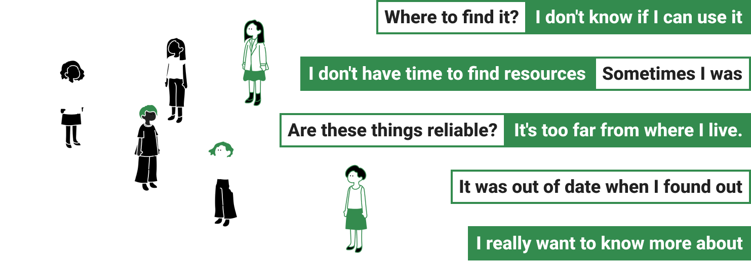
Lack of Awareness
Almost everyone mentioned being unaware that certain services or support systems exist or not knowing how to access them.

Time and location
80% of the interviewees expressed concerns about time and distance issues.

Reliability
50% of the interviewees were concerned about the trustworthiness of the resources.
Summarizing Research/Takeaways
Key Insight 1:
Limited food intake does not cover users’ requirements.
Key Insight 2:
The categories of groceries are limited.
Key Insight 5:
When Campus Food Banks are unable to meet students’ needs, students require more free or low-cost resources to fulfill personal requirements and reduce financial pressure.


Problem #1:
Campus Food Banks' limited offerings prompt students to seek additional free or low-cost resources.
Key Insight 3:
Out-of-stock items at the Campus Food Bank negatively impact the shopping experience.
Problem #2:
Campus Food Bank lacks timely and effective updates on food availability.
Key Insight 4:
The Campus Food Bank's fixed time and location can cause scheduling and commuting challenges for users.
Key Insight 6:
Objective factors (time/location/reliability) contribute to students’ inability to use resources effectively.
Problem #3:
Schedule and commuting are two objective factors that prevent students from accessing resources.
Key insight 6:
Subjective factors (awareness/emotion/preferences) can impact students to use resources effectively.
Problem #4:
Students' lack of awareness and negative emotions lead to their reluctance to use free or low-cost resources.
Problem/Opportunity Spaces
Problem #1:
Campus Food Banks' limited offerings prompt students to seek additional free or low-cost resources.
Solution #1:
Create a solution to provide more free and low-cost resources for food, products and other services.
Problem #2:
Campus Food Bank lacks timely and effective updates on food availability.
Solution #2:
Provide public chat groups for food banks to implement timely updates on food availability.
Problem #3:
Schedule and commuting are two objective factors that prevent students from accessing resources.
Solution #3:
Use reviews for credibility and clearly label resource locations and availability for user convenience in selecting based on time and location.
Problem #4:
Students' lack of awareness and negative emotions lead to their reluctance to use free or low-cost resources.
Solution #4:
Provide spaces for users to communicate, helping users feel more comfortable using resources.
The solution
Create an app that can help students easily find and comfortably use free and low-cost resources about available food and other necessities based on their time and location.
UX research method 3: persona

UX research method 4: Paper prototyping
I created paper prototypes to test if my solution meets user needs. This flexible method simulates interactions and gathers user feedback.


I gained a lot of valuable advice from users’ interaction with the paper prototype. These suggestions helped me to think about solutions from the user's perspective.
Trade-off & Design decision
Which pattern should I use to present solutions and why?
Trade-off: Page layout
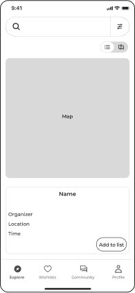
1

2

3
Design decision
I chose screen 3 for:
Combining images and text enhances the page's aesthetic appeal.
The cards in screen 3 provide maximum information in limited space.
Adding chips for food, products, and services helps users quickly filter resources.
Trade-off: Posts in Community

1

2

3
Design decision
I chose screen 3 for:
The top-to-bottom layout follows the natural reading flow, enhancing readability with an intuitive design.
The Campus Food Bank wanted a simple, intuitive community section focused on post content, so I omitted the "like" and "repost" functions to avoid distractions.
Keeping the review function and top/latest switch encourages meaningful engagement and increases interaction opportunities.
User testing & Iterations
I am not the user. What do users like? How do users use Wesource?
After completing the high-fidelity model, I wrote the evaluation plan and conducted multiple user tests with more than 15 people. I sought their most honest thoughts about the app without providing guidance.


After listening to suggestions from users and the Campus Food Bank, I made changes to the app in four key areas: the filter, login time, navigation bar, and chat button.
1/4 Iteration: filter
Change checkbox to chips to increase consistency and improve readability.


2/4 Iteration: Log in time
Defer the login time to maintain a seamless user experience.


3/4 Iteration: Navigation bar
Change “wishlists” to “favorite”.
Based on user feedback and the Campus Food Bank, I reconsidered the text for the navigation bar. A side-by-side comparison test showed that "favorite" was the preferred label for the heart icon.


4/4 Iteration: Chat button
Don't let the design overshadow the text.


Final screens
Wide variety
Use filters to help users explore resources and fulfill specific needs.

Let the user speak
Users can check and review resources to ensure the authenticity and reliability.
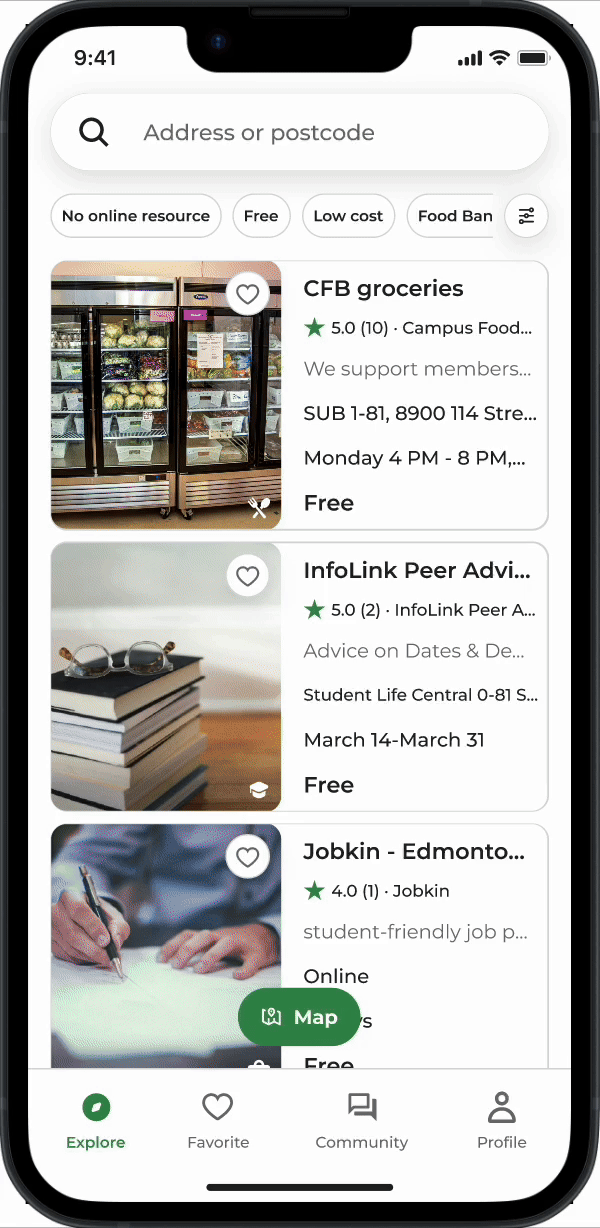
Map or list
Toggle between map mode and list mode for easy resource discovery.

Friendly community
Connect with others in the community and find partners.

Tracking availability
Get up-to-date information and stay informed about food availability.
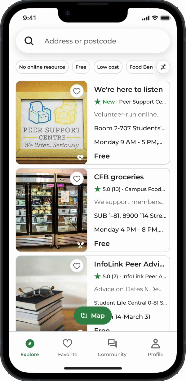
Flexibility in time and location
Users can select suitable resources based on their own time and location preferences.

Never forget
Easily browse resources by bookmarking them as favorites.

Conclusion
What I learned and my next steps.
A cyclical design process
I realize that design is not a linear process. While it's challenging to find perfect solutions to all pain points, I can iterate on my design to achieve a relatively user-friendly outcome.
Collaborate with stakeholders
I discovered that the process wasn't as smooth as I had anticipated. I had to carefully consider each step, recognizing that the needs of my clients and users might not align perfectly. Finding a balance between these evolving needs was crucial.
Next steps
To enhance user-friendliness, incorporate multilingual options into the design.
Collaborate with programmers for the coding phase.

Thank you :)
Check other projects

Coach Potato:
From couch to coach

Website redesign:
Redesigning the Campus Food Bank website resources page